Season 2 Episode 3 - Colour... colour... more colour
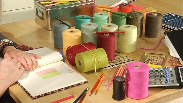
Ookie Dokie Artichokies, it’s time to break open that new box of coloured pencils, aka pencil crayons in Canada. I know you have all been chomping at the bit to use them.
In this episode we start looking for sources of inspiration, how to look deeper into an image or a flower and pull as much information from it as possible. I go through quite a few examples to show you what I see. With practice you’ll learn to see things you might never have noticed before. You will learn to see through new eyes 🙂
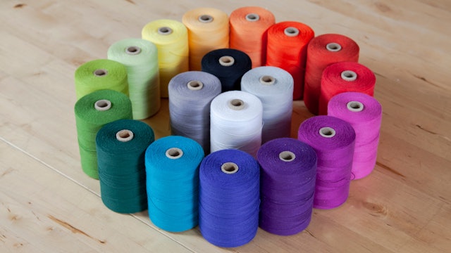
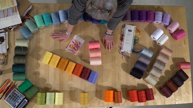
Then we match those colours to the yarns that we have available to us… not to colour chips that don’t match any yarn in existence and leave us searching for years for the right colour rather than weaving :).
We add colour to the graphics that we started developing in the last episode and finally it all starts coming together.
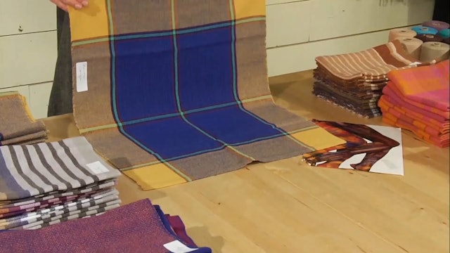
We end this episode with a stunning display of samples woven by students on the 2017 run of Colour & Design here is the JST studio. You’ll be so inspired by what they have put together from this workshop.
We are also including new PDFs that need to be printed off and added to your binder.
xo Jane
-
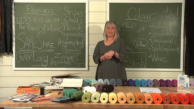
2.3.1 - Colour theory in a nutshell
The fun of understanding colour theory by using it while designing your cloth.
-
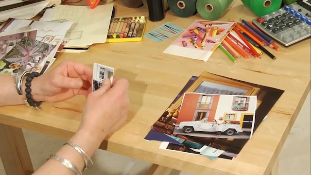
2.3.2 - Gathering your inspiration
Jane shows us how she finds colour and graphic inspiration while browsing through magazines.
-
2.3.3 - Pulling the colour from your picture
Jane takes you through the next step in design by pulling together the colours for her project.
-
2.3.4 - Pouring the colour into your graphic
Using the colours she has chosen, Jane adds another layer to her graphic design.
-
2.3.5 - A tea towel exchange
How one picture can be interpreted so many ways … watch this amazing Tea Towel Exchange!

